Tuesday, 10 January 2012

I'm orf

It's time for me to disappear again for a while -- so you can get partying instead of wasting your time on here.


Me? I'm off to lovely New York for a (cold) week -- though apparently it's going to be sunny, too, which will be nice. The last time I was there was, wait for it... 1997. Blimey. I am so old.


Anyway, maybe I'll get a new perspective on the city, post-Twin Towers and all that.

I'm rather looking forward to it all. See you in a bit!

Monday, 9 January 2012

Fluffing it

I love self-portraitists, and I particularly admire naked ones:


It turns out that almost all naked self-portraitists are, in fact exhibitionists, so we are sometimes lucky enough to see distinct changes in their work as time passes...


What starts out as simple art seems to undergo, as time passes, what I can only describe as auto-fluffing...


Either that or this chap's willy is growing at a fairly alarming rate...


They often end up here, at our final shot, with extreme close-ups:


My God, I love them all. Fabulous people. Won't hear a word said against them.

Er... that is all.

British Rail

Some lucky, lucky person has got hold of a British Rail Corporate Identity Manual, the holy of holies for any graphic design nerd like me...


British Rail was a pioneer of industrial design, and the 1966 identity, by the geniuses at the Design Research Unit, was one of the best corporate identities produced in Britain.


The Manual covered everything -- the symbol, obviously, plus the logo and the various regional brands...


Pantones and the identity on locomotives:


... on coaches...


... and even on lovely Freightliner containers:


Inevitably much of it was focused on the built environment, with signage for stations:


... the use of directional arrows...


But even down to the extraordinarily detailed, like the signs that could be fixed to coach windows:


... and, even more detail, the positions in which the signs might be fixed:


Incidentally, I was sitting in my hideous Class 365 "First Capital Connect" train to Norfolk, 1st Class, actually, and the only seat with a view had a vast sticker in the middle of the window telling me at great length what glee they would take in prosecuting me if I didn't have the right ticket. How times have changed.


Back to BR's corporate identity, and that was instructions for graphic design associated with on-board catering, as we now have to call it. I always loved that sunburst logo:


But who can resist looking at what passed for quality food in those benighted times, with even the 16 shillings and sixpence menu looking distinctly unappetising:


Scotch Broth? I mean, really? And Fruit Flan??

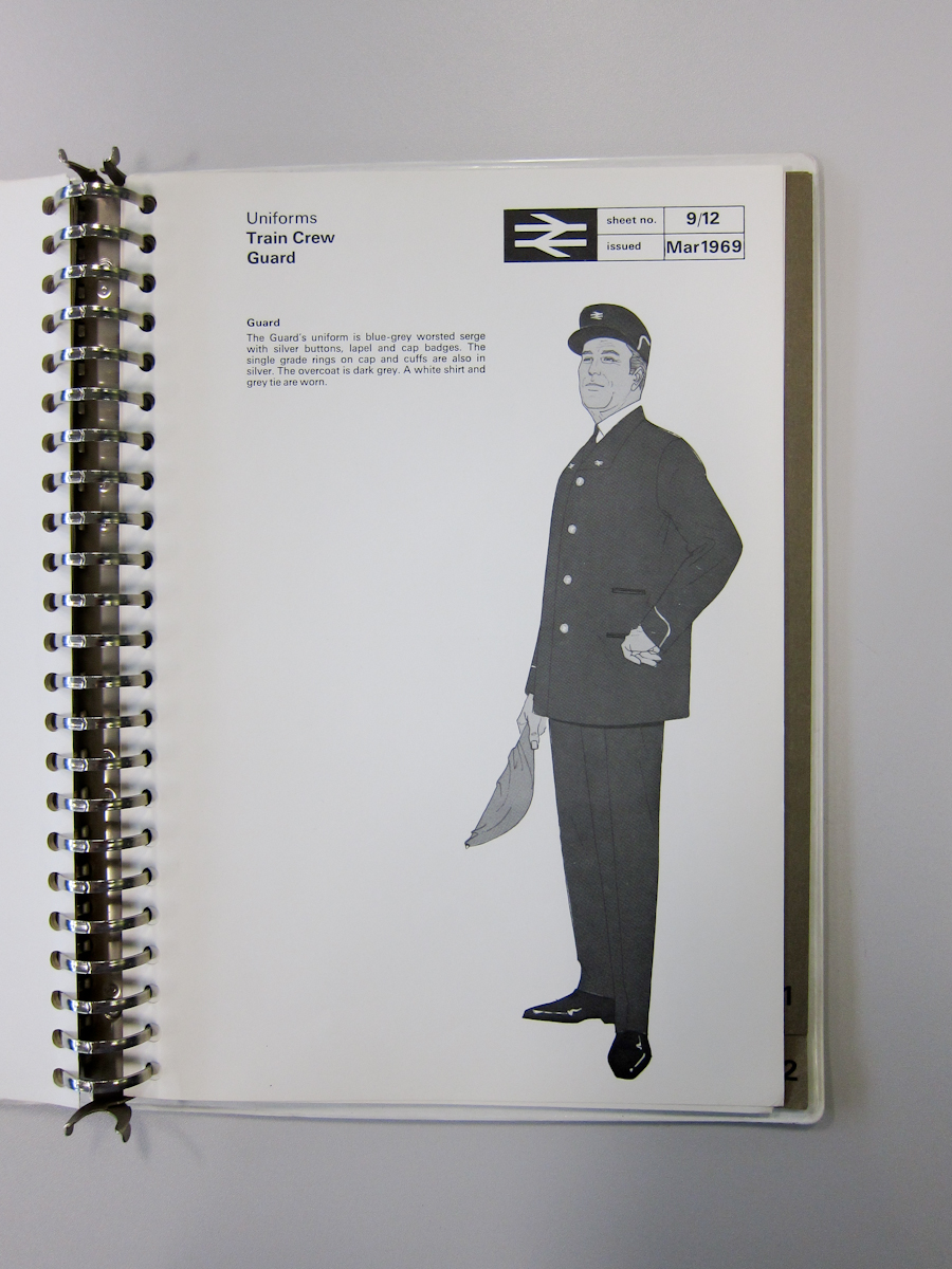
Much more interestingly, here's how dashing all the staff were to look (uniforms were by Hardy Amies, I think):


British Rail introduced the kepi for staff, and I always thought it looked rather grand, especially above that row of silver or gold buttons.


The catering assistants got a much less satisfactory deal, in my view:


And I don't even know what female couriers were intended to do, other than look a bit glamorous:


So let's end here, with the best uniform of all -- the fabulously stylish ticket office clerks, in their tailored light-grey linen jackets, needle-sharp black trews, crisp white shirt and pencil-thin black tie:


How chic is that? In fact, I wouldn't mind having that outfit to wear right now.


British Rail. They certainly were getting there.

Fallen angel

That's it, Goddamnit: I've fallen in love again.


Gabriel is the culprit this time.


It's weird, because Gabriel has clearly shaved away the hair from every inch of his body, an effect I normally dislike intensely but, somehow, on him, it makes me want to touch his skin...


I love his mad expressions, too, and the un-pumped nature of his body, all natural body tone.


What is it with me, that I fall so easily for these guys just from their pictures. But he is very lovely, isn't he?

InterCity rules

A fistful of Rail Blue fun, starting with a trio of shots featuring my favourite train -- The Fenman, the named InterCity service between London's Liverpool Street and King's Lynn.


That was a 1976 image of an English Electric Type 3 diesel-electric locomotive, commonly known as a Class 37, its glorious throaty roar heralding the arrival at the London terminus of a rake of Rail Blue Mk1 coaching stock. Here's the same train seven years later, heading north at speed near Cambridge, the Mk1s replaced with ultra-comfortable Mk2s:


That 9-coach rake was typical, but the eagle-eyed will have spotted something unusual. The middle three coaches in this rake are 1st class, brake van, restaurant-buffet. Normally The Fenman carried a brake 1st, then another standard coach before the restaurant-buffet.


Back at Liverpool Street in 1973, this last one (above) is a bit of a cheat, the headcode giving the game away that this is not, in fact, The Fenman, but I couldn't resist it for the deliciousness of the engine and for that view of the wood veneer lining the carriage doors. Beautiful. (1B55 is a London to Peterborough via Cambridge service, in case you were wondering.)

Here's one of the nameboards the service often carried:


For a bit of variety, that's on the nose of a brutish Brush Type 4, a Class 47, the most powerful locomotive to haul The Fenman on those rare days when a Class 37 was not available.

Meanwhile, here's another shot of what trains looked like back in the day when they were real trains -- with a Class 31 pounding through The Fens with no fewer than twelve (mostly Mk2) coaches in train:


That was a Yarmouth to Birmingham service, a route that used to be run by the lovely Midland & Great Northern Railway back in the days before its track was all ripped up -- our British Rail train was approaching Ely on a rather convoluted replacement route.


And, to finish, another East Anglian treat: a close-up view of a Class 31 (or, as we hardcore nerds know it, a Brush Type 2 -- even though its engines were later uprated to almost Type 3 power, although it never approached the power of the 37s...), hauling a train from the Great Eastern Railway's cross-Channel port at Harwich to the Midlands and the North-West. Those were the days when InterCity ruled.

Tuesday, 3 January 2012

Clayton fun

Ok, I know I was only recently banging on about Clayton Type 1s, but then I stumbled across this pair of fabulous colour images and I couldn't resist. The first is a rare-ish shot showing a Class 17 on a passenger train:


That was taken at Stirling in 1965, the year it was introduced, with a train for Edinburgh. This next one was taken the following year at Thornton Junction station, with a freight:


Just look at the delightful oily-black sheen on the lovely two-tone green colour scheme. Wonderful images.

Monday, 2 January 2012

HNY ok?

Some 93% of the photo allowance for this blog has now been used. We're rapidly heading towards the exit, as the fat lady (or, actually, skinny kid) starts to sing all operatically...


Just wanted to keep you informed -- and to wish you a happy, winkie-full 2012.

Saturday, 31 December 2011

Self lurve

Just a single, tiny image of this staggeringly sexy man, but it will serve to illustrate my point, I think.


A kind reader sent me some self-portraits showing me his fantastic winkie, but he kept his T-shirt on because he didn't like the rest of his body. Bodies are wonderful, and the photo in this post shows how alluring and sexy a body can be which is not gym-pumped or sculpted. Love yourself.

Giving head

Well, now, this is rather special: a photographer who takes lots of images of headless ordinary bodies.


I'm not usually wild about headless exhibitionism. It seems like such a dumb contradiction in terms.


In fact, it's a sort of failure of commitment. Either you are an exhibitionist and proud of it, or you're just a bit of an uncommitted sad case.


But so relentless and inventive is this photographer and his chums I'm inclined to give them the benefit of any lingering doubts.


And I love the constant comparisons of his friends' very varied winkies.


Even the occasional artlessly posed shot is not too disturbing:


And let's end here, with a fascinating contrast (and note that ugly elastic stretch mark. No pretensions here):


Please don't now send me a rash of headless exhibitionist self-portraits. Not unless there's at least one headshot in there. And I'm not just talking about your willy...

More new stations

That's completely infuriating. Within 24 hours of posting about the redevelopment of Farringdon station (see below) I discovered two brilliant aerial views that, had I known about at the time, would have featured prominently.


In that shot the two original trainshed roofs can be seen, side-by-side, with the new overall roof above them (the 1920s main station entrance is towards the bottom of the picture and, just below it, you can see some of the roof lights of the new Thameslink concourse. The new Turnmill Street side entrance is the long grey strip to the right). The right-hand trainshed is over the original station, the terminus of the world's first underground railway which opened in 1863.

Here's a wider-angle view of the whole area:


In this shot you can see the vast scale of the new Thameslink concourse, immediately below the original station entrance. The huge hole in the ground to the left of it is for the Crossrail concourse; when that line opens (in 2018) Farringdon will be the interchange for the two major cross-London rail arteries, making it one of the most significant railway junctions in the country.

Incidentally, in that last shot you can just see a building in which I lived for five years. Can you guess which one?! At the very bottom of the photo you can just see the roofs of Smithfield meat market. How appropriate.

Equally irritating, here's an aerial view of West Hampstead Thameslink:


The smart new concourse is centre-bottom (note the lovely green wall stretching up to the main road), and you can see the rather nifty new passenger footbridge and lifts that extrude from it.