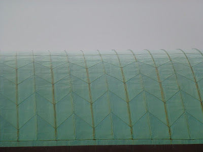
It has to be one of the ugliest, most soul-destroying places on earth.
That, above, is the view from Stratford "International" DLR station -- could they have made it more depressing if they'd tried?
While this is the soulless concourse of Stratford "International" railway station -- from which not a single international train runs:
Here's the outside of the DLR station, an ergonomic nonsense and a design disaster:
And here's a vista of the 1960s, Brutalist, Soviet-style "architecture" that we apparently think is the best face to put to the world in the 2012 Olympics -- these will be assorted athletes residences:
This is what counts as an architectural flourish at Westfield, the spiral multi-storey car-park ramp (complete with riot squad on stand-by):
Even when the sun comes out, these buildings don't look good...
The shopping centre itself is like something from Blade Runner, a veritable Hell-hole of pointless consumerism and vile Narcissism:
Having thoroughly depressed myself with this appalling development I set off for the real objective for this trip, a few stops further along the Central line: the 1950s bus station at Newbury Park:
Sitting alongside and parallel to the Underground station (though a stupid ticket barrier layout means you can't now interchange directly from one to the other), this remarkable building is all the more surprising for being in somewhere like Newbury Park:
On a grey, bleak, rainy day like today, it stood out as an obvious place of shelter, a beacon of hope in the miserable surroundings:
Unlike Stratford, Newbury Park feels like a properly designed place where care and attention has been lavished on the details (whether that's the plinth supporting the Underground roundel or the light fittings):
Such a sharp contrast with Stratford, where nothing seemed to be designed in any meaningful sense of that word.


6 comments:
The only design principle that governs places like westfield is to sling it up as quickly and cheaply as possible. After all you get what you pay for.
If you give up blogging, how will you off-load these passionate views you have?
I put it to you that you need to blog to exist.
Adventures in Beige, a big welcome to the rest of the UK (i.e. that bit outside London).
As a proud and out provincial guy, I love good design that makes us feel good. But these designs are strangely too familiar. I'm really sorry that the naffness of the regions has crept into our beloved capital.
I believe the modern architectural watchword is "form follows function". Obviously true at Stratford Westfield (and the Shepherd's Bush ditto, which I have vowed never again to enter, having been once and bought nothing) which I shan't be visiting.
Yes and if you think it is ugly now just come back in three or five years time and take a look at the exterior and how it will have faded and weathered. This sort of throw up up, cover them in cheap aluminium and glass structures do not age at all well. No doubt after the place starts to fall apart it will be cheaper just to bulldoze the whole thing and build again. I give a life of 20 years.
Form Follows Function is indeed a Modernist mantra, but you can follow function beautifully or shoddily; Newpury Park is meant to be an illustration of the former (it is, effectively, nothing more than a lean-to car-port, but it carries out that function with verve and style); Stratford is an illustration of the latter.
Just as you can have great Classical designs and rubbish ones, Modernism is no different -- and it would be equally absurd to condemn either style on the basis of the worst examples.
Post a Comment