
British Rail was a pioneer of industrial design, and the 1966 identity, by the geniuses at the Design Research Unit, was one of the best corporate identities produced in Britain.

The Manual covered everything -- the symbol, obviously, plus the logo and the various regional brands...

Pantones and the identity on locomotives:

... on coaches...

... and even on lovely Freightliner containers:

Inevitably much of it was focused on the built environment, with signage for stations:

... the use of directional arrows...

But even down to the extraordinarily detailed, like the signs that could be fixed to coach windows:

... and, even more detail, the positions in which the signs might be fixed:

Incidentally, I was sitting in my hideous Class 365 "First Capital Connect" train to Norfolk, 1st Class, actually, and the only seat with a view had a vast sticker in the middle of the window telling me at great length what glee they would take in prosecuting me if I didn't have the right ticket. How times have changed.

Back to BR's corporate identity, and that was instructions for graphic design associated with on-board catering, as we now have to call it. I always loved that sunburst logo:

But who can resist looking at what passed for quality food in those benighted times, with even the 16 shillings and sixpence menu looking distinctly unappetising:

Scotch Broth? I mean, really? And Fruit Flan??
Much more interestingly, here's how dashing all the staff were to look (uniforms were by Hardy Amies, I think):
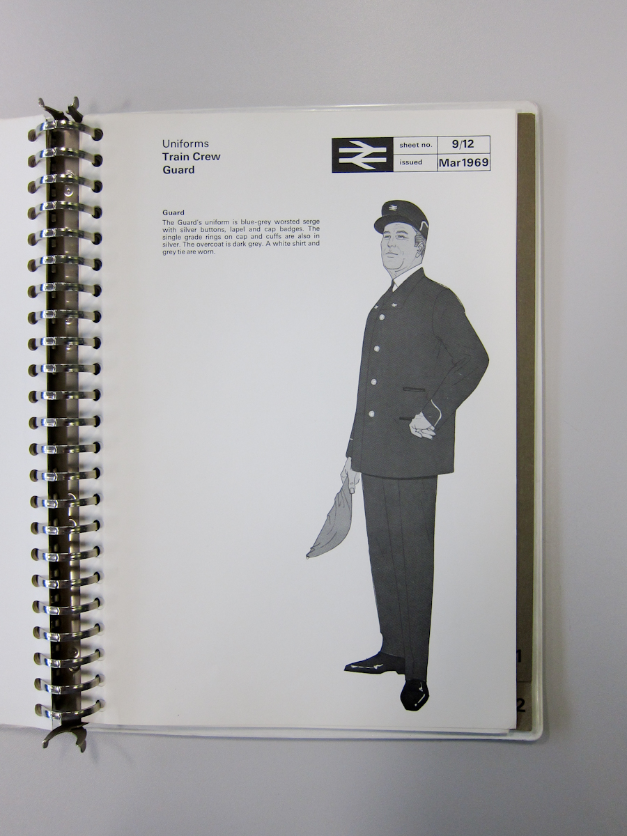
British Rail introduced the kepi for staff, and I always thought it looked rather grand, especially above that row of silver or gold buttons.

The catering assistants got a much less satisfactory deal, in my view:

And I don't even know what female couriers were intended to do, other than look a bit glamorous:

So let's end here, with the best uniform of all -- the fabulously stylish ticket office clerks, in their tailored light-grey linen jackets, needle-sharp black trews, crisp white shirt and pencil-thin black tie:

How chic is that? In fact, I wouldn't mind having that outfit to wear right now.

British Rail. They certainly were getting there.


2 comments:
If you liked that you'll like this from TfL http://www.tfl.gov.uk/assets/downloads/corporate/tfl-colour-standard-issue03.pdf
Oh and this too http://www.tfl.gov.uk/assets/downloads/corporate/lu-basic-elements-standard-issue02.pdf
Post a Comment